Showing posts with label artists. Show all posts

Saturday, January 16, 2016

//NEW//
GLOSSARY MAGAZINE


MORE ABOUT GLOSSARY:
SENTIMENT #1. Sentiments are Glossary's Letters from the Editor.

Glossary Magazine is publishing reviews about San Francisco Bay Area art, through a creative lens.
It is a project space for looking at and interpreting art as much as it is a critical voice.
It is for gallery goers and collectors, scholars and students, thinkers and lovers; or those who fancy to be.
It is a familiar story told in a different way.
Because, no real progress can be made by doing things the same way as everyone else, or as before. Enjoy! - Leora Lutz

READ GLOSSARY'S FIRST REVIEW: REVIEW AS PICTURES

Sunday, May 24, 2015

Margo Wolowiec: The Elusive Narrative, written for Surface Design Journal, May 2015

Margo's work is really stunning. Here is an analysis of her work for your reading pleasure and art edification.

Margo Wolowiec: The Elusive Narrative By Leora Lutz, published in Surface Design Journal, May 2015
Original print copies can be purchased here.


The inundation of images on the internet makes for a primordial soup that requires a weeding out to stay afloat in the quagmire. The choice to look or look away, constantly poses a conundrum between the pressure to be informed and involved; while simultaneously attempting to maintain some semblance of disconnect for the sake of one’s identity and peace of mind. At the root of Margo Wolowiec’s weaving’s is a rigorous practice of gathering images from the internet, then reappropriating and manipulating them to a tangible end. Her work bridges the ever-lessening divide between technology and the hand-made. The result is work that not only addresses formal qualities of geometric abstraction, but also questions the phenomenology of memory, place and the archive.

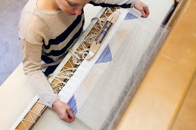
For the last four years, Wolowiec has predominantly been using technology-based making processes in conjunction with weaving techniques. Usually, she uses white warp threads, but this past year she has been adding color with traditional dyes. These are then woven as plump and rounded “X” shapes that mimic Photoshop brush tool lines. In an email conversation, Wolowiec made a personal connection with painter Laura Owens’ representation of Photoshop brush tool shapes. Although Wolowiec equates her work in dialog with painting, she does not feel it necessary to defend her work in the art vs. craft discussion. Dipping into post-minimalism’s use of fabrics and mixed media, her work alludes to abstract painting while at the same time denying the material of paint. Using a symbolic reference to a brush tool adds a layer of technology that works in conjunction with the hand, pushing the implications of the maker’s control.

It is the conceptual lack of control that activates her work beyond the tangible tools and obvious references. While working on new techniques in 2012, Wolowiec recalled her grandparents pining over her childhood city of Detroit. Their memories overwhelmed her with a sense of loss and lament. For her MFA thesis exhibition Hin Und Weider at California College of the Arts in 2013, she wrote “In my practice, this lament has become a fertile ground for analyzing and revealing changing landscapes of immateriality, opening up new understandings of language, the body, and personal histories.” With these thoughts in mind, she began the first works that involved printing images of Detroit maps on the weft, which she left unwoven to further reiterate the incompleteness of the city in its current state.

The unweaving continued while her archiving process for gathering images expanded in works that were shown in January of 2014 at Johansson Projects, Oakland. Wolowiec uses an app on her smartphone that automatically downloads images for her and places them in a Dropbox folder. As she goes about her day engaging in the real world, “liking” things and taking pictures on Instagram, the app is responding and auto-archiving more images out of the worldwide Web based upon her interests or preferences. Later, Wolowiec goes through the images provided for her and begins to form new relationships with them. For instance, she has been making an album of “dream homes”—images of houses where she wishes she could live. But where does the space between reality and fiction collide? She is allowing feelings of anxiety and desire to fold into the selection process, to generate meaning and to create narratives that she prints onto the weft threads using a sublimation process. 


The first stage of the process involves printing mirror images on heat sensitive paper. The second step is extremely laborious, requiring that the weft string be laid out on top of one printed image, close together in a single layer. The mirror printed image is then laid on top of the string and the three layers are pressed together in a large heat press to set the dyes onto the string. Because the strands are loose and not yet bound, there is a high chance for irregularity—specifically, the sides of the string that are not imprinted with ink leave a tiny white band. Once the strings are woven onto the warps, these small untouched spaces next to bright colors lend an overall static effect when viewed from a distance. For Wolowiec, process quirks are fully embraced as inherent of the string’s materiality, and conceptually play into the work’s premise to upend what is known or remembered and therefore archived. 

In April 2014, Wolowiec mounted a solo exhibition of new work at Anat Ebgi Gallery in Los Angeles, drawing from current everyday online source imagery and Navajo traditions. The show remarked upon notions of place and how one locates themselves in greater conversations, akin to the Navajo’s use of abstract symbology and methodology.Embedded in Navajo visual nomenclature are keys to understanding each weaver and their interpretation of culture. Each author inserts their own narrative into each piece, signifying an unspoken understanding conveyed by a visual language known in the community. 

Deborah Brinkerhoff (curator of The Navajo Weaving Tradition at The Bruce Museum in 2000) remarked that the weaver’s intentions and personal meanings are embedded in the work. “The individual’s freedom to make decisions about design, color and technique has remained at the center of Navajo weaving.” Viewers may interpret the work for their own edification; the artist’s true intentions will never be entirely known or revealed. “The meaning belongs to the textile,” Brinkerhoff explains. Like the Navajo, Wolowiec’s weavings are elusive and open for analysis. Her appropriation of Internet imagery provides clues to her trains of thought, but the rest is left hidden in the textile. 


Bold and vividly arresting patterns dominated the scene at Anat Ebgi Gallery. Throughout the selection, large diamonds or wide bands hover over fields of smaller abstract patterns. The titles lead the viewer into a curious dialog with the work. Due North and A Specific Direction point toward an unknown locale, although inferences can be assumed based upon color and hints of representation. In the former, blues, blacks and whites are predominant, while indecipherable figures bleed through water or snow. The second is more ambiguous: a chevron pattern, used on road signage to delineate lanes or caution directional cues of a curving road. Crumpled in the Back Seat features layered diamonds in golden, canary and butter yellows. The morbid connotation of the title seems to imply a car accident, while the yellow diamond shapes appear to emulate warning or caution road signs. The blur of the layered diamonds mimics the whirr of a speeding car. Meanwhile, Three Degrees and No Visibility refers to aeronautic stipulations and extreme wind direction variance classifications for flying. Together, the titles and the material converge in Postdigital storytelling.

Postdigital artists are concerned with creating semblance between technology and humanist needs such as haptic gesture, physicality, dimensionality—anything that relocates the body away from the screen and activates it in the tangible living world. As the Postdigital artist and theorist Maurice Benayoun points out, “I rely on technology as long as it helps me improve and make clear my relationships with other people, or better comprehend and deal with the world. Only then, I consider technology as my tool of choice.” For Wolowiec, technology and gathering an archive serve as the intangible portion of material, while string and weaving are the literal materials. Both are tools dependent upon each other as the concepts and subjects of her work. But it is up to artists like Wolowiec to take technology and use it for other ends, to bring it forth as concept, subject and material. Wolowiec, like other artists today, is working in an era that has no distinct movements, except for that of the digital—a pervasive entity that encroaches upon everything in life, not just the arts. “Today it is necessary to include the information world within the “tissues” of the real,” Benayoun continues. 


Although Wolowiec does not self-identify as a Postdigital artist, there is a parallel with her process and a humanist focus. “We are slipping further and further in to a digital realm,” Wolowiec stated recently, “and this is somehow truncating our daily methods of communication.”Her work eludes direct narrative, concentrating instead on the intangible qualities of communication—those moments when reality becomes a figment, where memory serves to fragment, and the archive— albeit tangible “proof”— is only a portion of the truth. All of which is very real and somehow peaceful, despite its elusive nature.
At the time this article was written, Margo Wolowiec participated in a three person group show at Laura Bartlett Gallery in London in January 2015 and she mounted a solo exhibition titled Corrections and Exposures at Lisa Cooley Gallery New York in February the same year. At the time this blog post was published, Wolowiec's work was included in the Grandpallazo, Italy, sponsored by Artsy.
[1] Quote from artist’s website, www.margowolowiec.com
[2]M’Closkey, Kathy,"Towards an Understanding of Navajo Aesthetics,” in Seed, Vol 14. 1, Department of Sociology and Anthropology, University of Windsor, Windsor, Ontario Canada. http://www.library.utoronto.ca/see/SEED/Vol4-1/M%27Closkey.html
[3] Liebenson, Bess, “Reading into the Navajo’s Rug,” The New York Times, December 3, 2000. http://www.nytimes.com 2015-02-03T19:31">
[4] Interview with Maurice Benayoun by Lorenzo Taiuti, Digicult, issue 064,
http://www.digicult.it/digimag/issue-064/critical-fusion-interview-to-maurice-benayoun/
[5] Email conversation with the author and the artist.

IMAGE CITATIONS:
Installation view solo exhibition at Anat Ebgi, 2014. Image courtesy of the artist and Anat Ebgi.
Untitled 1969, Hand Woven Polyester, Cotton, Dye Sublimation Ink 55" x 70", 2014. Photo credit Phillip Maisel.
Crumpled in the Back Seat, Handwoven polyester, cotton, linen, dye-sublimation ink, fabric dye 81 x 57 inches, 2014. Image courtesy of the artist and Anat Ebgi. Studio installation view, Photo credit Phillip Maisel.

Sunday, March 2, 2014

writing for San Francisco Arts Quarterly

This month marks my one year anniversary of writing for San Francisco Arts Quarterly (SFAQ).
Sometimes, when I go to art openings or sit with artists and colleagues I hear complaints about criticism, "sustainable art journalism," the status of the "SF artworld" in general and the lack of art writing "out there."

The primary definition of the word criticism is basically: to express a "negative opinion," to find fault with something. But the less popular definition is to analyze, to weigh both merits and faults objectively. I go to see art and write about  it so that I can offer more to the reader than what meets the eye. True, it is my perspective, but I don't call myself an art critic - I call myself an art writer.

To read my most recent archives, visit the SFAQ archive.

A hand selected list of reviews can also be found on my website.

And for instant gratification, a few of my picks for the year:


 Ben Barretto
Above: (L) Tear Away, 2013. polyester and lycra athletic trainer pants. 61cm x 91.5cm.
(R) Three on Three, 2013. polyester and lycra athletic trainer pants. 61cm x 76cm
Image courtesy of the artist and The Popular Workshop
Below: desert, 2013. retired rock climbing ropes. 111.5 x 140cm
Image courtesy of the artist and The Popular Workshop


 Above: Your Motion Says You Are In the Mood, 2013. wood, paint, floor padding, misc. 
approx. 96" x 84", Photo by Kristine Eudey.
Below: Untitled sculpture from "your motion says you are in the mood" at n/a gallery, Oakland, 2013. wood, resin, fern, balloon, misc., approx. 108" x 84". Photo by Kristine Eudey.


Above: Interior view of Oculus by Kate Short. 
Foreground, Chris Duncan, Everything All At Once, live performance.  
Oculus, approx. 10' diameter x 8" tall comprised of speakers. Photo by Leora Lutz.


Above: Installation view of "Tonight, Tonight" by Facundo Arganaraz. 
Image courtesy of the artist and Highlight Gallery.
Below: Passenger III, automobile paint, direct to substrate print, brass fitting on aluminum composite panel, 60" x 48". Image courtesy of the artist and Highlight Gallery.
(*Please cite responsibly and accordingly if you happen upon these for your own "research," Pinterest, PR or whatever: include all artist's information, artwork specifics and photographer courtesies.)

Saturday, June 30, 2012

Lawrence Weiner on peoples' dreams


Making art is about objectifying desire. 
You have to make it (life, artistic practice) "A" happiness, instead of "The" happiness.

The reason you place something in the world is because of the sensuality 
and the relationship of human beings with objects.
Art is about f*ing up peoples' dreams.
Everything they thought -- the way the world is, you're not happy about. 
So you show them another way that the world could be. And it works - they're stuck. Because they can no longer go back. You've changed their logic and the way they see themselves in relation to the world.

(An existential hero is): Someone who is able to ignore - literally ignore - the structure of the confines they [heed?] and get away with it. And that could be absolutely anybody. You don't have to be special and you don't have to be smart - you just need to know that really and truly you don't approve of the structure that's being presented to you. 
It comes to a point where you just have to say "no".
I really thought the whole point was to dream about things you don't know about - that when you wake up in the morning it was not "that way" - that you have to make it "that way".

+++

More on Lawrence Weiner:
Lawrence Weiner: If in fact there is a context: 100 Notes, 100 Thoughts, Documenta Series 008 


Lawrence Weiner: Something to Put Something On
  
+++
The above quotes are excerpted, hand-transcribed text from a video of an artists' talk in Antwerp, 2009.
It is from Part 1 of 5 total taped discussions with Lawrence Weiner.
ARTIST TALK: LAWRENCE WEINER at NICC
in collaboration with Extra City.
18-03-2009 Tulpstraat 79, 2060 Antwerp, Belgium.
www.nicc.be / www.extracity.org

Tuesday, March 6, 2012

Luca Aontonucci and Cybele Lyle, Space Time and Architecture at Royal None Such Gallery, Oakland

Luca Antonucci and Cybele Lyle talk about their collaborative experience for their two-person show at Royal None Such Gallery in Oakland. The collaborations were not the type where singular pieces were created with four hands, but rather meetings and conversations happened with regard to the sharing of ideas and concepts. The discussion was moderated by Christina Linden, Associate Curator of Painting and Sculpture at the Oakland Museum of California.

In 1941, the scholar and critic Sigfried Giedion wrote Space, Time, and Architecture, a now-classic multidisciplinary analysis of architecture and city planning (originally written in 1970 and now with over 13 revisions). This book became the material for Luca Antonucci's work in the exhibition -- not what the text speaks of, but rather, the book is a material outside of itself as a work of text in space and time.

Antonucci has painstakingly crossed out text throughout the book's entire 690 pages with a fat black felt-tip pen. The gesture ultimately reveals and highlights phrases or images that the artist deems more important and relevant to the conversations at hand in his work. The decisions he made were arbitrary - not to be confused with random. Early on in the process, he devised a codex for crossing out, which was later abandoned for its trite nature, and was eventually replaced with conscious decisions that revealed themselves through the act of reading the book.

The act of revision is something that the human mind and people in general are often struggling or occupied with; so for Antonucci, it made sense to do the crossing out by hand, as opposed to using ruler or tape. The act of crossing out the text by hand was important because its nature of doing so is not a total erasure and still reveals the edges of the letters that are left behind in the wake of the gesture. Crossing out text, or selecting portions of text (common with Dadaists) seems to be a gesture that  contemporary art never tires of. It is a game that never seems to get boring - and a ritual that we are compelled to ceaselessly perform, because each iteration can be new and changes over time or with each new artist -- or editor.

In the show, there is a cyclical overlap between direct, literal motivation of editing text and the actual artworks that Antonucci created for the gallery space. Reprinting (in a sense, republishing) the book in a new photographic format re-contextualizes the book as fragmented edits - objects in a removed state from the space they originally inhabited.


Also in the gallery are glowing pieces by Cybele Lyle. In contrast to Antonucci's text images, Lyle's works are photo collage of landscape.They seem to be illustrating the new architectural text that Antonucci presented for us to read. Embedded within the images is an honor and respect for the landscape that does not impose upon it, but rather inhabits it. Each piece is an imaginary place that act as puzzles or fragments of Lyle's childhood interaction with nature. The compositions pull apart the landscape and put it back together as a way to remove power of the artist and to allow more agency for the viewer to move around them -- to inhabit them. The work can be entered because there is no specificity of place. Lyle views her process as one akin to editing a book.

Both artists engage a negotiation of space and time between the artist and the observer. They are each connecting the dots between the space made by each gesture, whether it be crossing out text or cropping and repositioning photos. The spaces allow a place to not only enter easily, but to sit comfortably in them and contemplate. Together the work is indistinguishable because the collaboration was so symbiotic. The artists assure us that this way of working is far better than being stuck in a singular way of doing things or making art.

The scale of all of the work is proportionate to a big, cozy coffee table book -- something one could hold comfortably without extending the arms too far wide to hold it in front of the face or in a lap. They are intimate, but substantial. In fact, the artists are making a new book, which will create further space to delve into the work - in our laps, comfortably in our private spaces.

Tuesday, January 31, 2012

3020 LAGUNA IN EXITUM site specific project, San Francisco, curated by Amir Mortazavi of M-Projects

3020 LAGUNA IN EXITUM, curated by Amir Mortazavi differs from a standard group show, which usually involves several artists whose work falls within a curatorial concept, to be viewed in one place, such as a gallery for instance. Instead, this show is a collaboration in which several artists augment a singular home that is under construction in order to create work in-situ. The work of Gordon Matta-Clark comes to mind.

Gordon Matta-Clark, Conical Intersect, Paris, 1975.


At 3023 LAGUNA IN EXITUM , the place becomes the art form, after which the "work" done there, and to it, also becomes the location for viewing the project.

For this project, there are several instances of fragmentation, which create negative space: only to reveal new ephemeral spaces of light and disjointed remnants of domestic desire and routine history within. Below is Andy Vogt's installation that involved slicing and reassembling the floor.


The edge of Vogt's piece leads to a space open to the elements, the floor ending at a sharp drop off to the ground below.


Fracturing the space throughout, there are beautiful moments within the discard, the reconstitution and the deconstruction of this Cow Hollow address.


During deconstruction, and amidst the clamor that took place over the course of several weeks, the neighborly curiosity of two small children who lived next-door gained momentum. Curious of the noises as the days went on, they could not wait to attend the opening reception with little plastic hammers in hand, ready to demolish and help with the demise (or the unbeknownst) reconstruction of the place. Seeing these tots wandering the partitions with curious looks, holding their little plastic hammers - ready - I forgot a lot about whatever was bugging me that day. I wondered about the negative space that is embedded in the innocence we lose as we get older. How often I want to just f* sh*t up with a hammer - even with the most helpful intentions. Ultimately, well, it's just not what reasonable grown-ups do . . . onward. . .

Down I went to what people were calling the basement -- but really it was the garage at one point. Not today. Behold, a pool of water nesting in thick black plastic sheeting - rafters and beams slanted here and there, placed along the edge of a man-made pond. One could wonder if this is the aftermath of a possible flood that occurred due to a plumber's poor planning error. On the other hand, it resembled a Roman bath, the planks enjoying the afterglow of nature's possible performance in their habitat.


Miss Door, dipped into the water to cool her heels - she had had enough of keeping people out and letting them in. Her distance between them always in periphery. Her hand, always taken and turned - either way, she was always the same to them, just inverted depending on which way the person was going. It is strange being in a constant state of limbo.


In all - the address - the house that once was is in a suspended state of progress within progress in order to be demolished in the near future. It will be gone - negated, replaced by something grand and monumental...better? Regardless, it's purpose as a place will always be, no matter what form it takes.


Curated by Amir Mortazavi and David Kasprzak.
Artists are: Jeremiah Barber, Randy Colosky, Chris Fraser, Christine Peterson, Yulia Pinkusevich, Jonathan Runcio, Jesse Schlesinger, Gareth Spor and Andy Vogt.

Monday, December 19, 2011

nothing 2

 An art which stirs the human soul through forms which resemble nothing known, which represent nothing, and which symbolize nothing: an art which works soley through free invented forms, like music through freely invented notes. - August Endell, 1890.

A precursor for what he may have really wanted to do, but alas he was stuck in the flourishes of Art Nouveau.

Related Reading: nothing

Thursday, June 16, 2011

panel discussion: ARATALAND with Doug Harvey, Michael Arata and others

I recently went to a panel discussion that included Mat Gleason, David Pagel, Doug Harvey, Carol Cheh and artist Michael Arata. The panel was before the closing of ARATALAND! a mid-career survey of artworks by Michael Arata curated by Doug Harvey.

ARATALAND! is a massive exhibition of Arata’s (obvious) incessant production of works that perplex, and perhaps giggle at us, with us, and maybe even because of us. The works are curiosities and commentary on things jovial, and also things serious. It seems a netherworld between adult-hood and youth, between the past and the present. 

The work renders circumstances of the time in between youth and now as memorials of past experiences called out in googly eyes, red rubber balls, uniforms, pine cones and more. In the company of this art, we become aware of the present, of standing there looking, engaging, trying out different things, playing with parts, writing something, wiping our hands, gazing, snooping. The four floors of art were a voyeuristic and at once immersive and secret experience in public. I wish I had seen the show before the panel….anyway...

One of the things that has stayed on my mind since the panel discussion was when Doug and Michael spoke about the symbiotic nature of the collaborative relationship between curator and artist.  I have always related to this notion of curating as collaboration during my time as Gallery Revisited founder. I approached my curating as a form of art-making …that I was making something out of the artwork to put it into context and to present to the public. 

Approaching what one does as an extension of what the artist does, required a huge amount of collaboration with the artists. Because in the scheme of things, everyone needs to be on the same page - as in of the same thought, and in the same zone to contextualize and ultimately present the work. If we didn’t jibe about where the art was or what it was doing, then the show would not be as successful. 

This type of collaborative curating is different than a collaboration to create work, it is different than just simply picking work out of the studio to show, and again different than curating by commissions. Doug was working with 20 years’ worth of Michael’s art making for ARATALAND!

Formally speaking, a "retrospective" is most likely the most ambitious project for an independent curator to pursue. I use the term retrospective in quotations because although the work spans 20 years, there was not a real effort to specify dates of the work. Doug and Michael both eloquently and politely took the stand that the specific years are not as important as how the ideas were put together.

One person at the panel did call them on the semantics of the word and the purpose of informing the viewers of the chronology, but I found this remark to be a formal excuse to criticize a point that was already so clearly and intelligently answered. My view was that there are expectations with placement of work within a space, and that if the chronology doesn't match then the expectations of the viewer becomes confused. 

But that is not a bad reflection on the curator, it just means that things are shifting with how some people think a retrospective should occupy space. I personally like the choices that Doug and Michael made, because placing 20 years of work by idea, not by year, was a much better way to organize. Ideas ebb and flow and sometimes come back around, they linger, they repeat - they don't just go in a line from one to the next and never look back.

The panel continued with the usual banter between art making, making money, writing, putting things in a space, choices and a long segment on conflict of interest (since there were writers on the panel, too).

And finally ending that for a retrospective, the show was done on the Cheap: locally, (with lots of sweat and drinks, I am sure) and without institutional support that it deserves. But I am sure that the show will travel…Armory? Basel? …who knows.


Sunday, February 20, 2011

Steve Roden and John O' Brien at Cerritos College Art Gallery

"drawn into dialogue" Curated by James Mac Devitt,
Cerritos College Art Gallery.

Architecture in Peril...
Cerritos College Art Gallery, history of the architecture and its current state
john o brien and steve roden This exhibition is on the advent of a major reconstruction to the art gallery facilities at Cerritos College, located in the city of Norwalk, California.
In the mid-1950's, the seminal architecture firm Kistner, Wright and Wright were asked to create an affordable, modern and efficient art department facility for the then burgeoning historic Rancho Los Cerritos neighborhood east of Los Angeles. KWW's architectural aesthetic is inspired by Postmodernism, and rooted in DeStijl, Bauhaus, and centered around the notions of simplicity, harmony and function.

The initial construction coincides roughly around the time of the California Master Plan for Education in the 1960's.

As beautifully stated by James Mac Devitt, the curator of the Cerritos Art Gallery in the show statement excerpts:

The beautiful fragility of that post-war California dream is now reflected in the deteriorating facades of many of the buildings on the 21st century Cerritos College campus, including the Fine Arts building that houses the gallery. With eyes perpetually on the future, the dreamer that was/is Modernism just wasn't/isn't prepared to deal with the boring reality of maintenance. Modernism was never really interested in preserving the past or the status quo, even it meant giving up its utopian credibility.

We find ourselves at a very unusual moment in time, when our pristine dreams for the future sit side-by-side with the decaying dreams our past. We would be remiss if we allow this chance of self-reflection to pass by without comment and/or critique.


Here is a video of the site-specific sculpture created for the courtyard of the Cerritos College Art Gallery.


Art Installation Process is a "Duet"

The collaboration between the two artists, and the dialog that is reciprocal with the work makes for a contemplative and engaging show that is a reflection of the past, a nod to the future, and a moment caught in time.

The work of the two artists is distinctly different, but not without common threads, and a common understanding. The two are long-time friends, so it is only natural that their work bears a relationship already inherent in their personalities, interests and subsequently their friendship.
It is this friendship that upholds the integrity of the collaborative process. With that comes mutual respect as well as a kindred relationship with themes and execution. That aside, it is not entirely relevant to the work itself, but more of a point toward the nature of collaborations and the impact they make in the public sphere.

In this case, we see a coming together of minds on a visceral level with regard to time, and to subject matter. Both artists have created works that reflect the language inherent in the landscape, both as metaphor and as concrete examples.

Inherent relationships with the landscape
...more dialogue
john o brien, Storied Landscapes, Paesaggi StoriciIn the collaborative process, both artists mixed and matched work from their drawing archives as well as created new work that was site-specific and sight-inspired, if I can use the term plainly.
Two overlying themes are addressed in the work; that of the architecture - the main reason for the show in the first place, and that of the landscape - the decomposition, degradation, utopia, or the myth of utopia.
Architecture is called out in the metal "cages" created for the gallery space, as well as a site-specific sculpture outside that includes a sound piece. The landscape comes through in the drawings displayed in the gallery.

A few of my favorite pieces were a series by John entitled "Paesaggi Storici (Storied Landscapes)".
I immediately drawn to the apocalyptic, sublime beauty of the painterly places on the work, and the messages in the collage placement of photographs, repeated on the paper surfaces.

Geometry and Architecture
...further construction of the deconstruction
In addition to the works on paper by both artists there were metal grids that John had built and they were installed on the walls of the gallery, with the drawings behind them.

I have mixed reviews of these structures. Frankly, I found it distracting, and it gave a Jail quality to the space. It also confused the space, and it was unclear if these girds were permanent. Perhaps that is the most interesting thing about my observation because of the nature of the show and the reason for it...(see the "Architecture in Peril" Link for more on this).

Since both artists are such strong thinkers, I would not be surprised if this is exactly what they were going for , this jail/permanent/impermanent quality.

Regardless, my personal opinion I would have rather seen these grids made into a sculpture that created a structure within the space, rather than creating a mirrored wall/architecture response.
Either that, or perhaps one wall with this wall sculpture, but not with the drawings behind and in them...this is just my aesthetic choice.
More inherent relationships with the landscape
Both artists work with abstraction, but Steve's work differs from John's in its use of geometry related abstraction, as opposed to a more expressionistic realm that John explores. I like both equally but for these differing reasons.

In particular, although not the most geometric in the show as Steve's "Space Station (for Bruno Taut)".
Taut was a German architect of the Weimar period, and I am familiar with his "Glass Pavilion" - a helix/domed roof of colorful stained glass & concrete created in 1914.

The piece that Steve created has obvious references to Taut's architecture - the hex shapes, multi colors reminiscent of stained glass....but what attracted me to it was my landscape interpretation of the work. I read the shapes as crystals, before I read the title of the piece. In viewing it, a sharp, cold terrain came to mind. Knowing the title and the artists intent I see a nod toward man's intervention with the landscape and a dual meaning with destruction. I also see a visual attempt to relate to nature that architecture plays.
I also related to the black background and the ways that the colorful shapes were scattered on the page reminded me of the sky translation work that I do.

In short, I felt a kindred spirit with the works by both artists.

Steve Roden: In Between
excerpt for the catalog description for his solo show at Amory Center for the Arts.
Southern California artist Steve Roden is known as more than a painter; his internationally acclaimed, multi-media sound-driven works use musical scores that offer him a set of options to compose a segment of painting, sculpture, or other formal composition. Roden's every artwork, whatever its form, is both familiar yet utterly unexpected. He's an eccentric virtuoso whose paintings look abstract, but only in the way that a chair, a tree, a face or even a Pop-Tart becomes abstract the longer you look at it. This catalog of a 20-year mid-career survey of Roden's work includes an illustrated essay by curator Howard N. Fox and a CD with the four soundtracks from Roden installations.


Sunday, January 30, 2011

Lee Materazzi photos and live performance at Art Los Angeles Contemporary

Quint Contemporary was doing laundry at the Art LA Contemporary fair.
Featuring work of Lee Materazzi.

Materazzi's work takes us into her characters' domestic mishaps and relationships. Her interactions and struggles with the banal and tedious things around her impart a feeling of discomfort while at the same time a tone of the ridiculous. As in, we cannot help but laugh at the predicaments that our protagonist finds herself in. It's not a belly laugh, but more like that laugh in your heart you get when you see someone lose the scoop off of their ice cream cone.
I was remembering a time when I was attempting to remove the ugly cabinet that surrounded the little sink in the bathroom. At some point during the deconstruction, I found myself lying on my back with my feet propping up the sink. I remember lying there trying to maneuver tools and brackets that I needed to use with my hands to get the job done, all the while not able to let go of the sink. Remember, I'm holding it up with my legs while lying on my back - otherwise it would fall forward and bring the whole plaster and lathe wall down with it...

Back to Materazzi:
Task becomes toil and ritual, with a distinct relationship overtone between the every-day and fetishism. There is also a tension regarding the purpose of the things that she engages with - each item carrying with it a personality, each interaction containing a conversation.
For example, a vacuum cleaner is no longer a cleaning tool, but a late afternoon romp in the sheets, arms and legs entangled....or is this a struggle? A wrestling match with an uncooperative inanimate object?

Did she trip over the hose while rounding the corner in a hurried cleaning session before guests arrive? Has the vacuum become a replacement friend or lover - someone reliable who won't argue back? This mind-fantasy that ensues in viewing her work is to me, the very crux and ultimate success of this series.


-->
These images capture something new about addressing domestic/sexual/ritualistic/identity/gender roles in art. They lack kitsch, and a chip on the shoulder. It has instead, a simple truth and humble reality. The way in which the pieces are created rides on the fence between actuality and staging. The mood is not a moment captured in the time, but rather a simple documentation of occurrences. I found myself creating scenarios in my head about what lead up to the event pictured and how in the world this woman would get out of the predicament I was looking at.

My favorite was the triptych "Birthday Cake".

I have to now confess that this work is getting to me more the next day.
In the onset of the task to make a birthday cake, the protagonist has chosen to do this facial treatment instead. The result is a decided action that ruins the intended meaning of the original form. Aside from a few obvious reads, such as makeup or the masks that housewives must wear, the cake is no longer a food gift/given. It is now a food that must be taken - and in the most intimate way by licking it off her face...or it must be denied, by not having it all and washing it away.


Overall, there is definitely an enmeshed relationship going on with her subjects and the viewer.
images courtesy of Quint Contemporary

Wednesday, December 15, 2010

kindred spirit recap: Kathy Pendergrast

In Winter 2009 I mentioned the artist, Kathy Pendergrast and how our work is similar in some ways.

She had a show in 2010 at PEER in London.

I really love her Black Map series
Her process gives the illusion of a starry night, by blacking out the map and leaving behind dots that denote inhabited areas.


I have been working on the Whole Stars series:
Star Family, and Star Couple

Hand-painted paper with grommets

Wednesday, October 6, 2010

air research

I was recently invited to be a collaborator for a project I mention on movement 365 blog, called ARTVULUPS.


I am to do a piece about Air. (pdf)

My collaborator is Virginia Viado, an urban planner for a private corporation in the San Bernardino region.


I will be working on a smog map.
I am layering silhouetted areas from various air emission maps that are created by various agencies that are responsible for the air we breathe.

In addition, there will be some mapping that notes other emission related data, like electric car outlets, ethanol and veggie gas stations and so on... I'll post it when it is done.


Here is some research I did:

“Fear less, hope more; Eat less, chew more; Whine less, breathe more; Talk less, say more; Love more, and all good things will be yours” - Swedish Proverb

Allesandro Ricci - smog paintings
Article about the artist.

Kim Abeles
smog portraits, maps etc.

Artist known as Smog City

Charles Gaines "Greenhouse" + article in White Hot Magazine


Air Now dot gov -- link to air quality website

UK smog exhibition

I should really quit smoking. I just don't feel like it right now.

Particulate Matter - little air polluting particles


breathe in, breathe out


“If you do not breathe through writing, if you do not cry out in writing, or sing in writing, then don't write, because our culture has no use for it.” - Anais Nin

Tuesday, September 7, 2010

Ecstatic Energy does Mojave Desert

Ecstatic Energy Consultancy Inc., is a conceptual masquerade, if you will, that looks like a consultancy business, but really is a collaboration with artists & other curators.
Ecstatic Energy Consultants Inc. is a Los Angeles– based firm that  provides experiential assessments into  the relationships between  institutions, the public, and the natural  sphere...Ecstatic Energy Consultants Inc. emerged in 2009 as an expression of  its  founders' interests in the increasing strangeness in contemporary   America. 

The "problems" that their "clients" seek solutions for, become schemes of intersecting ideas in order to foster witty, insightful & elaborate interventions that foster dialog, bridge lacks of awareness and inspire change.
What creates inquisitive visual confusion and humor on their website, are the stock-esque images usely seen in corporate advertising sites:

What drives the tongue to the cheek is:

Our team’s combined accomplishments  in the fields of activism, art, design, new-age physical therapy,  non-profit administration, publishing, psychedelics, sailing, and  theater enable us to offer our clients a sensitive, multi-dimensional approach. Did I just read, sailing?

A recent "client" is Elana Mann. 
Ms. Mann's work centers heavily around performance, public engagement or intervention, global and international issues, politics, gender, identity....it is very rich and full. Many of her curatorial projects are collaborative in nature.

It is here that we see the lines blurred between artist and curator - a topic of recent discussion: It is not straightforward collaboration, because there is an initiator who conceives the project without group consensus, invites others to participate, and is vested conceptually and sometimes financially in the idea. But it is not straight curating either, simply for the fact that they are participating as an artist.
Perhaps a new word is needed for this type of person/artist/curator. Curatist? Articurist?

Anyway, I can't help but see how Ecstatic Energy's clever guise as a business is a perfect solution to this very conundrum:
EEC Inc.’s Energy Assessments are first built on a foundation of  research. We take a systemic view of the focus of our investigation, and  try to learn the dynamics of all the kinds of energy that flow through  that system. This provides us with a network of concepts, meanings, and  synchronicities--a bird’s-eye view of the whole thing. We then perform  an experiential analysis where we use our bodies, our senses, our  intuition, and our openness to chance. Using both of theses kinds of  inquiry allows us to find the myths in the systems that are so often  overlooked.

Which poses the question, of art systems and Geographic Identity.* What are our masquerades and who do we masquerade as?

----The Project----
The project (case study) they created with (their client) Elana Mann, is the eec004 - Subaru Outback.
We plan to look at which car’s raw materials come from conflict zones,  imagine if cars could become vegetarians, look at gridlock as a possible  productive time for drivers and passengers, and find reverie in other  reflections about how we get from one place to another.
The project aspects were:

Fundraiser with
Donor stickers designed by Steven Anderson of  EEC, Inc. and magnetized to the car :


I chose to contribute an "inspirational message" (Kowabunga Dudes),  instead of my name as a sponsor. I was thinking more like riding the  wave, and unfortunately did not know it was also used by Teenage Mutant  Ninja Turtles.

Assess & Prep the Car: 


Mojave Road Trip:


Exhibition "Driven by What's Inside":
Saturday, October 2nd, 2010
7pm to 9pm
Side Street Projects in Pasadena, California
730 North Fair Oaks Ave.
Pasadena, CA 91103


You can view the entire photo album on their flickr site.
photo credits: Ecstatic Energy Consultants Inc. with Elana Mann and Jean Paul Leonard

Ecstatic Energy Consulants, Inc.


* In keeping with my blog theme for movement 365 (Geographic Identity).